How To Design a Homepage For Your Landscaping Website
Do you want to create a landscaping website, but aren’t sure how to design it?
Creating the design of your landscaping homepage can be one of the most difficult first steps of creating your landscaping website.
Fortunately, like other pages on your site, there are common elements used across all landscaping company websites that you can imitate.
In this article, we will discuss the common elements included in a landscaping company homepage and how you can personalize them to your business.
7 Common Elements Included in a Landscaping Website Homepage
Landscaping Services Navigation Menu
Cover Image and Introductory Information
Services Section with Brief Descriptions
General Information Section
Company About Us Section
Landscaping Portfolio Section
Landscaping Careers Section
1. Landscaping Services Navigation Menu
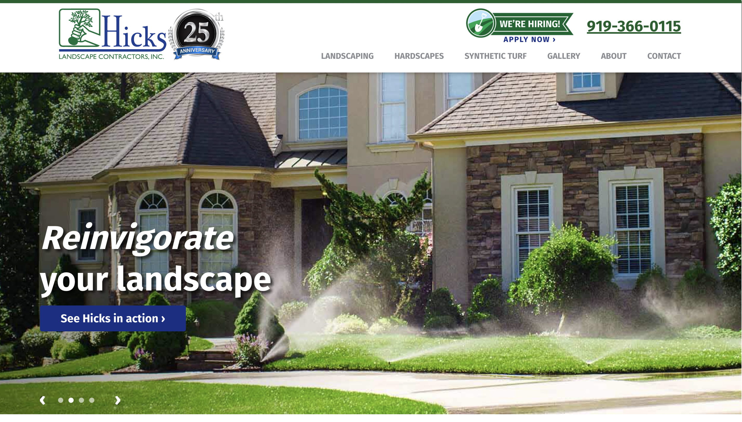
In the landscaping services navigation menu, you will generally have your logo on the upper left hand corner, then your services, and then your contact button on the right.
Depending on how much information you would like to fit into your website navigation, you may have a thin pop up banner at the top, or widgets for customers to click right above your main navigation menu.
However, as you are just beginning setting up your landscaping company’s website navigation, we recommend that you keep it simple and straightforward. This will make it easier for you to design and easier for your customers to navigate.
If you offer both residential and commercial services, you can structure your menu items like:
Residential
Commercial (optional)
Landscaping Supply (optional)
Landscaping Portfolio
Service Area
About Us
Careers
Contact Us
If you don’t offer commercial services but offer a variety of residential landscaping services, you could structure the menu items like:
Maintenance
Design (optional)
Installation (optional)
Landscaping Supply (optional)
Landscaping Portfolio
Service Area
About Us
Careers
Contact Us
2. Cover Image and Introductory Information
Your coverage image and introductory section will be one of the more creative sections of your homepage because there are many ways to design this portion.
Some companies stick with a simple full screen banner image with text and a CTA (call to action) button on top, which is the most traditional route.
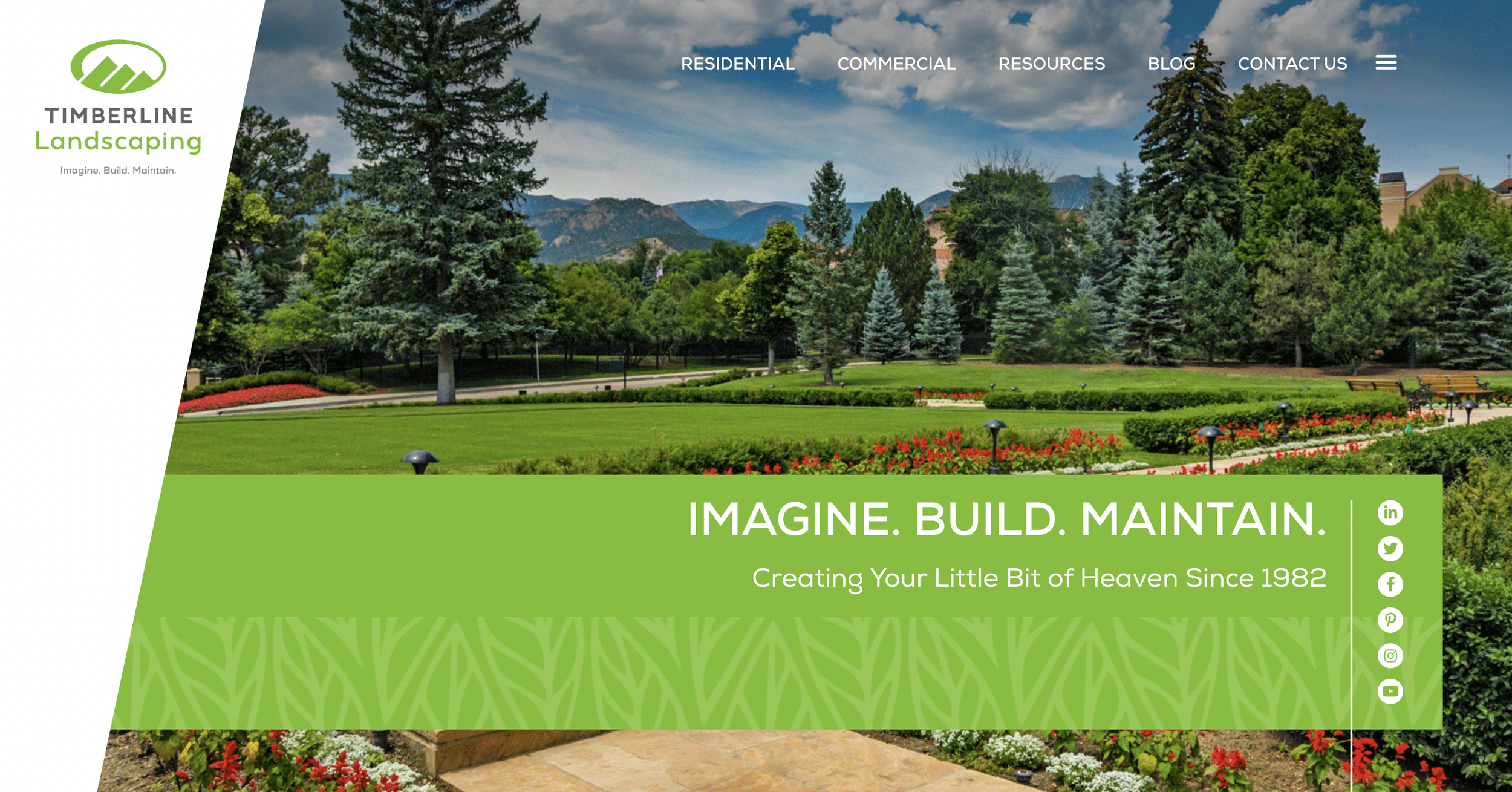
Other companies will put a diagonal shape or other kind of shape over the banner image and add additional elements, like a “request appointment” form or social media links.
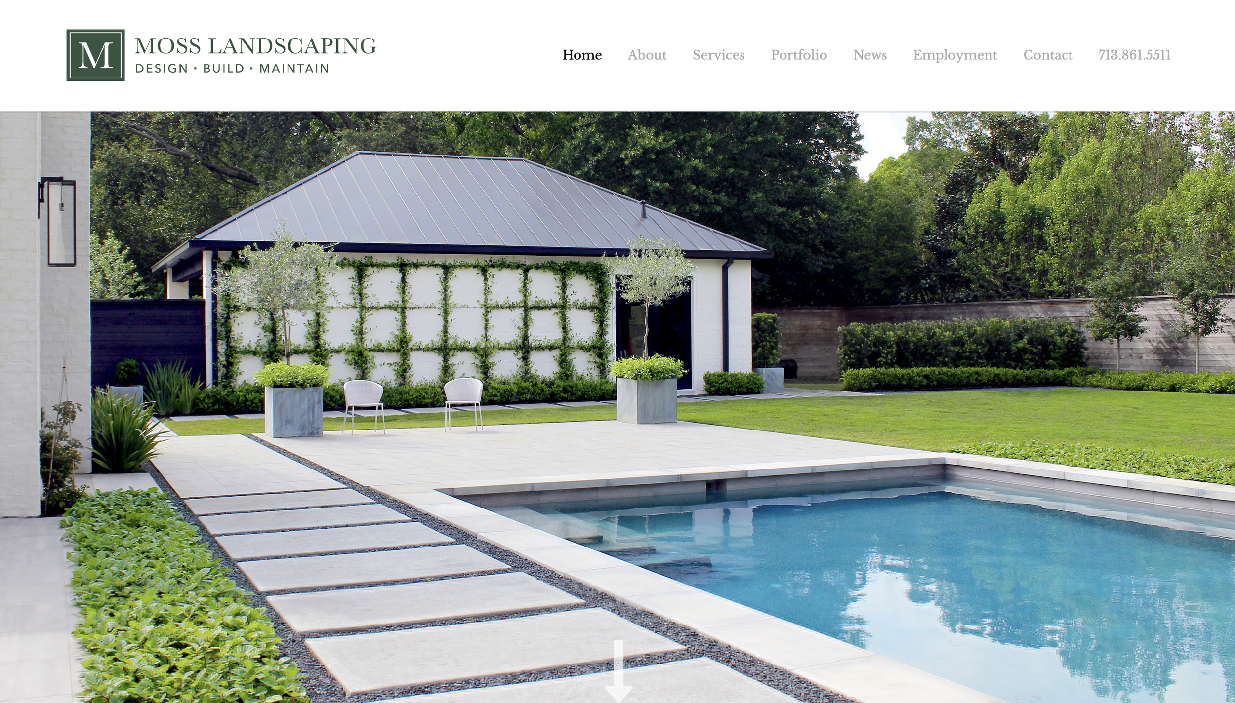
In some cases, landscaping companies choose to stylistically just have a banner image with no text. This is most fitting for landscaping design companies that want to showcase their work on the screen with no obstructions.
However, if you are just starting out, we recommend that you go with the simple banner image, text, and CTA (call to action) design. This is the most straightforward design and allows you to include text that describes how you help customers.
The text you include on top of your banner image will most likely serve as the H1 (heading 1, also known as the title) of your page. Due to this, you should aim to keep it brief and to the point (generally around 60 characters or less).
Using North Carolina as an example, here are some types of heading 1’s you can include are:
Providing Quality Landscaping Services for The Triangle, NC
Top Residential and Commercial Landscaping Company
Covering All of Your North Carolina Landscaping Needs
Keep Your NC Property Beautifully Manicured All Year Long
Ultimately, this heading will encompass the services you provide and the area you service. You can either use it to broadly encompass these two things, or you can write it in a way that addresses how you help customers.
The last example “Keep Your NC Property Beautifully Manicured All Year Long,” is an example of how you can gear it more towards your local customers goals. Ask yourself, “What is the biggest thing my services address for customers?”
Perhaps it is as simple as you keep their yard looking beautiful all year long, perhaps you take the hassle of worrying about their lawn off of them, or perhaps you help them with something else.
3. Services Section with Brief Descriptions
Your landscaping services section will be the most straightforward section on your site. You will create images, blocks, or buttons with the title of each service you offer. Depending on the services you offer, you can keep your services broad (e.g. commercial and residential) or more detailed (e.g. landscaping, maintenance, irrigation, etc.).
Customers will be able to click these to get to a page with more information about the service. Since customers will want to click for more information, you should prioritize getting those pages written and created first.
Depending on your design, you may also have space to add brief descriptions about the services to give customers more of an idea of what you do for each service.
Having descriptions to go with your services can be a great way to provide your customers with information if you do not have dedicated pages for your services yet. These descriptions can also add SEO (search engine optimization) value to your homepage.
4. General Information Section
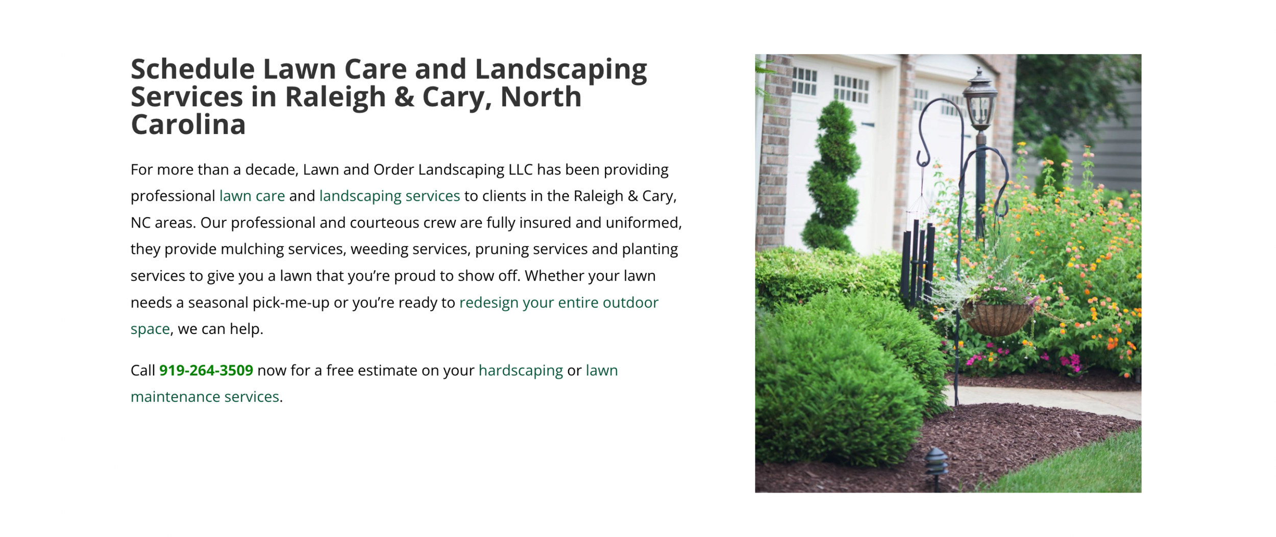
Your general information section will usually have an image on the left or right with a text section to the opposite side that contains a heading, a paragraph, and a CTA.
Your general information section will be geared towards similar elements as your homepage heading. It will contain details about the services you offer and information about the area you service.
Since this section will highlight all of your landscaping services at a high level, you can end this section with a general call to action that prompts customers to contact you for landscaping services.
5. Company About Us Section
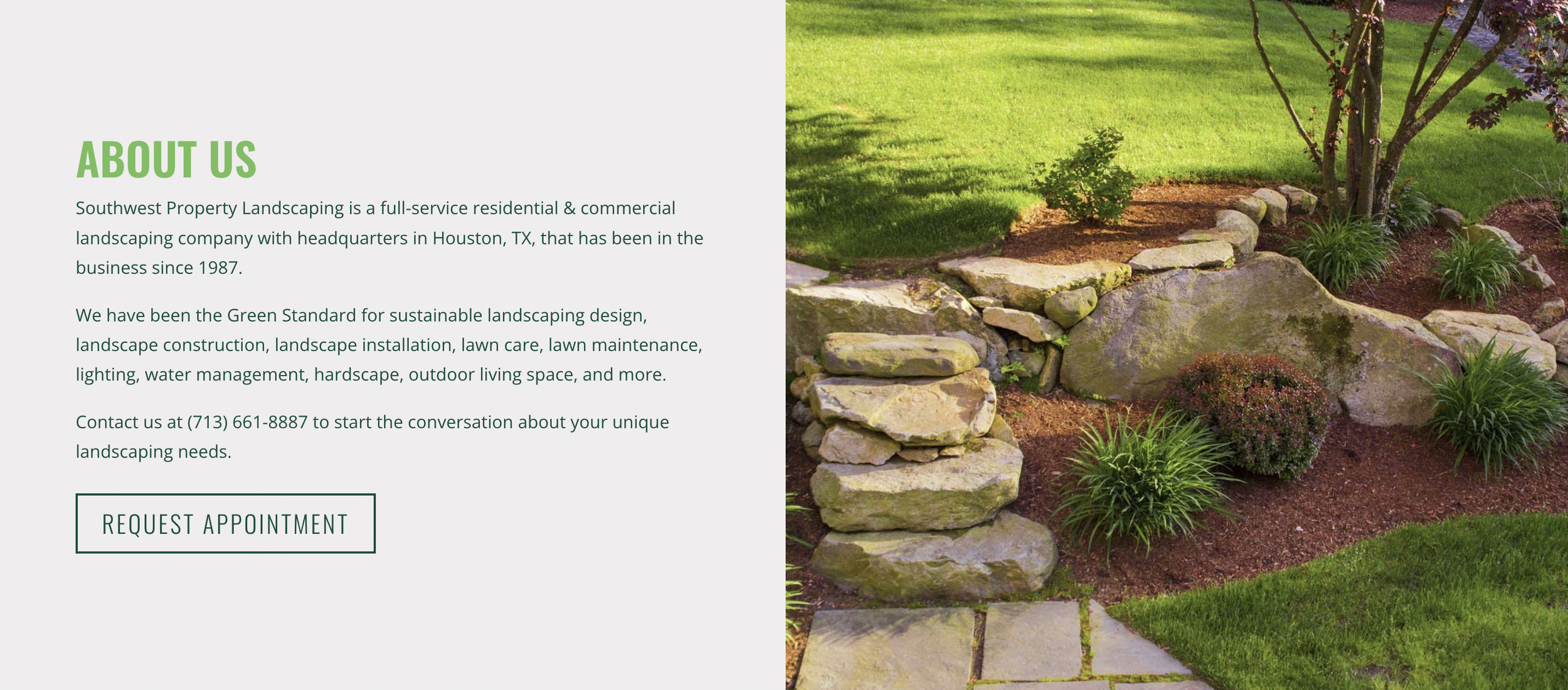
Your About Us section will usually be structured similarly to your general information section, with an image on the left or the right, a text section on the opposite side, and a call to action button.
You should use this section to briefly highlight the type of information you include on your dedicated About Us page. At the end of the summary paragraph, you can link to your full About Us page.
6. Landscaping Portfolio Section
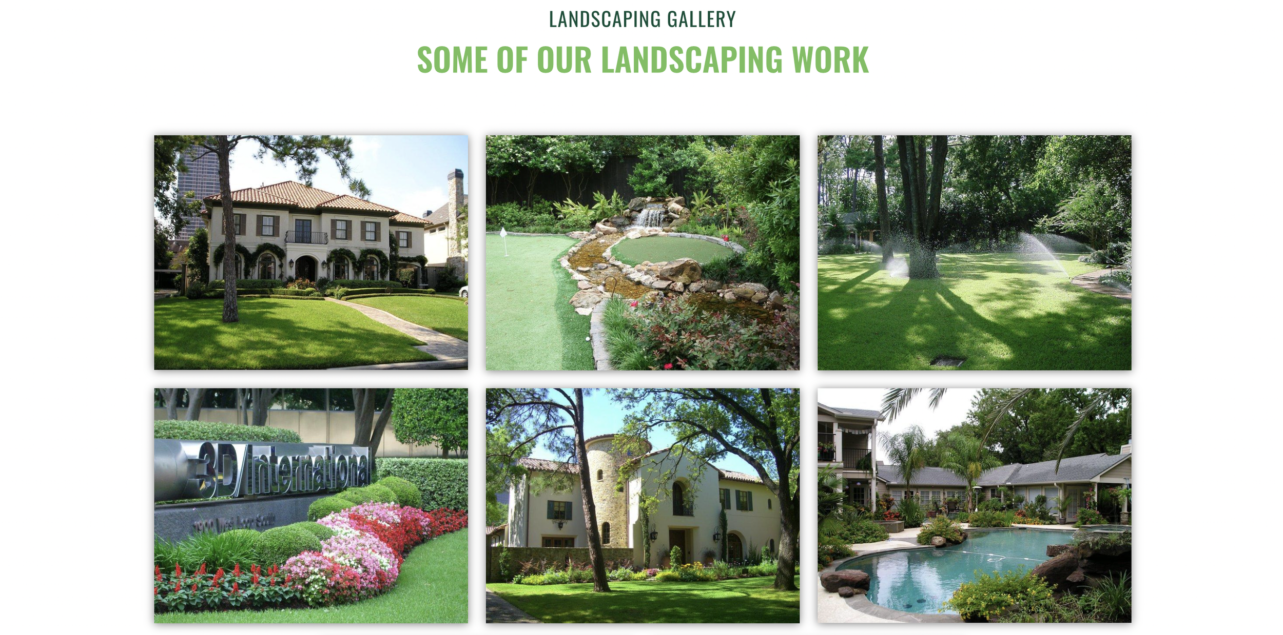
The next section you can include on your landscaping homepage is a landscaping portfolio section. This section will include images of your landscaping work.
Depending on the type of landscaping services you offer, you may have different types of photos of your work. If you do commercial landscaping and residential, you can include a combination of residential and commercial projects or you can create a dedicated section for each.
If you primarily do landscaping maintenance, you could create a before and after photo collection to show how you have improved yards.
7. Landscaping Careers Section
The last type of section you can include on your landscaping homepage will be a landscaping careers section. The design of this will differ depending on the information you want to include and if you would like to include multiple photos or elements.
However, if you are looking for a more straightforward design, you can include an image on one side, details about the reasons why candidates would want to work for you, and a CTA to your career page.
Some landscaping companies will use the paragraph section to include a list of their open roles or benefits of working there.
Design an Effective Landscaping Company Homepage
As you begin to look at more and more landscaping company websites, you will begin to notice that all of them contain a mixture of the 7 elements we covered in this article, which can be easily replicated.
To find inspiration for your landscaping company’s website, you should look at different landscaping company’s websites from a variety of states and begin to identify the kind of style you want to emulate.
If you have any questions about designing your landscaping company homepage, contact us today. To keep learning more about how to create an effective landscaping company website, subscribe to our newsletter below.


